Responsive web design is a technique used to optimize the viewing experience for the user by providing easy navigational access and legible reading by adapting the layout to the users device. The responsive website will adapt to whatever device it happens to be on, whether it is a desktop computer, a tablet or a mobile phone.
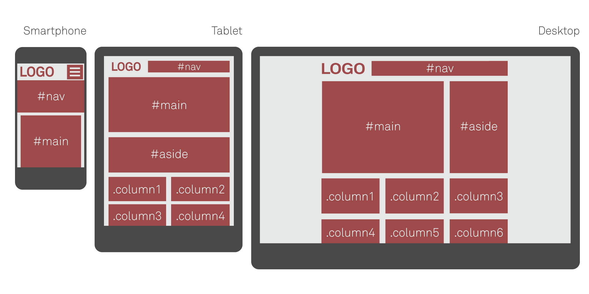
An example of how a responsive layout can change on different devices.
Mobile first[]
One common approach to responsive layouts is designing with mobile in mind first. This means that the layout is specifically designed to work on a mobile device, and extrapolated upwards, adding extra content as neccessary upto a large desktop monitor. This ensures that the website is fully functional at a small size and does not feel like a compromise of the desktop version.
Responsive Layout Technologies[]
CSS3 @media queries are used to tell the browser how the website should look at various resolutions and sizes (resolution does not always imply physical size, especially in the mobile world). One advantage of using media queries is that mobile browsers with javascript turned off will still be able to layout the site correctly.
Below is a simplified example of the structure of a CSS file for a responsive website/application.
/* CSS file */

/* Section 1 */
/* CSS for all screen sizes, regardless of width. */

body {color: green;}

/* Section 2 */
@media only screen and (min-width: 480px) {

    /* CSS for devices with larger
       than or equal to 480px wide screens. */

    body {color: blue;}

}

/* Section 3 */
@media only screen and (min-width: 768px) {

    /* CSS for devices with larger
       than or equal to 768px wide screens,
       i.e. iPads. */

    body {color: yellow;}
    padding: 10%;

}
In section 1 we write the "global" code. This will always be read and interpreted by the browser regardless of your devices screen size since there are no conditional requirements stated.
In section 2 things are getting interesting. Here we are using a media query to tell the browser to only interpret the code between the brackets if the screen size is at least 480px wide. Note that the CSS syntax is the same as outside the media query (since we want it to look structured, it is indented another step though). In this section we override the style in section 1 making the text color on all devices 480px or wider, blue.
In section 3 we increase the size even further. In here you'll style for sizes at least 768px wide. This is primary used for tablets. Again we are overriding the text color, but this time we add a padding of 10%. Only creens 760px or higher will read and interpret this.
The pattern you see is you start small and increase in size step by step, including every size possible, optimizing the viewing experience for a maximal number of visitors.
You are not restrained to use these particular sizes and can write any positive amount of pixels in a media query.
Standard sizes[]
The snippet below is a good template utilizing common screen sizes across a number of devices.
/* Smartphones (portrait and landscape) ----------- */
@media only screen
and (min-device-width : 320px)
and (max-device-width : 480px) {
/* Styles */
}

/* Smartphones (landscape) ----------- */
@media only screen
and (min-width : 321px) {
/* Styles */
}

/* Smartphones (portrait) ----------- */
@media only screen
and (max-width : 320px) {
/* Styles */
}

/* iPads (portrait and landscape) ----------- */
@media only screen
and (min-device-width : 768px)
and (max-device-width : 1024px) {
/* Styles */
}

/* iPads (landscape) ----------- */
@media only screen
and (min-device-width : 768px)
and (max-device-width : 1024px)
and (orientation : landscape) {
/* Styles */
}

/* iPads (portrait) ----------- */
@media only screen
and (min-device-width : 768px)
and (max-device-width : 1024px)
and (orientation : portrait) {
/* Styles */
}

/* Desktops and laptops ----------- */
@media only screen
and (min-width : 1224px) {
/* Styles */
}

/* Large screens ----------- */
@media only screen
and (min-width : 1824px) {
/* Styles */
}

/* iPhone 4 ----------- */
@media
only screen and (-webkit-min-device-pixel-ratio : 1.5),
only screen and (min-device-pixel-ratio : 1.5) {
/* Styles */
}
Good to know[]
The iPhone load websites completely zoomed out, rendering the code above useless. To fix this, simply add the following meta-tag in your <head>-section:
<meta name="viewport" content="width=device-width; initial-scale=1.0" />