Color and how we experience it has been essential for man since he painted the first cave paintings, and is of course as meaningful and important today as it was then. With color we can shape the emotions of the observer, and so, knowledge about colors and how and why they affect people can be a very powerful tool when used correctly.
Remember that rules can be broken. Just make sure that it is deliberate, thoughtful and well executed if you do.
Categorization[]

A color wheel of the RYB color model showing the primary, secondary and tertiary colors.
Let's start with the basics. Colors are categorized in a primary, a secondary and a tertiary group. Since human vision is trichromatic (meaning we have three independent channels for conveying color information) we usually use three primary colors only. The primary colors vary depending on the work you're doing since different tasks require different color models (we’ll go more in depth with this later). In the RYB color model we use in the color wheel to the right, the primaries are red, yellow and blue. Red and yellow gives us orange when mixed, yellow and blue makes green while mixing blue and red creates purple. These are our secondary colors. By then mixing two secondary colors or a primary and secondary color we will get our tertiary colors.
We can also categorize colors in a warm and a cool group. Red, orange and yellow are all warm colors. Cyan, blue and purple are cool. There are always two primary colors in the warm group and one primary color in the cool group regardless of color model used.
Additive and subtractive colors[]

Additive color shown using the RGB color model.

Subtractive colors shown with the CMYK color model.
The term additive color is referring to color created by mixing light of different colors, the most obvious example being in the computer monitor you are looking at right now. In additive color systems red, green and blue are almost always used as primary colors and these colors are what the pixels on your screen consist of.
A subtractive color system subtracts light waves from a bright (usually white) surface when different dyes, paints, pigments or filters are added to it. This is the basic principle behind paint; it absorbs some of the light coming at it and reflects the rest of it which our eyes then perceive as a specific color.
Color models[]
The most common color models are RYB, RGB and CMYK. RYB (red, yellow, blue) predates any modern color theory and is very popular among artists. Today we know that CMYK (cyan, magenta, yellow, key/ black) is a far better combination to use to produce the widest range of colors.
RYB and CMYK are both subtractive color systems while RGB is an additive color system.
Relationship between colors[]
Some colors just don’t work together and some colors are perfect for each other. Distinguishing what works and doesn’t is easy for some and not so much for others. Luckily this is a skill one can practice on perfecting and having knowledge of how these relationships work is a step in the right direction.
Analogous color scheme[]
This is a group of colors that are adjacent to each other in a color wheel. One color is dominant (usually we pick a primary or secondary color) and two accompanying colors on either side (usually tertiary colors). We want our analogous colors to stay within a 180 degree periphery on the color wheel. A narrower angle will give us a more visible connection between the colors we’ve picked; too narrow an angle will make it difficult to tell the colors apart.
Complementary color scheme[]
Two colors which will give us a neutral color - white, grey or black – when combined are called complementary colors. When placed next to each other, complementary colors will make each other appear brighter and more vibrant. In some color wheels – the RYB and RGB model for example - the complementary colors will be directly opposite each other.
A split complementary is another color scheme and is achieved by choosing a color and then the two colors adjacent to its complementary color. This gives you a scheme with about the same contrast between the colors as two complementary colors would, but more relaxed.
We also have the triad color scheme which is made up of three colors evenly spaced in the color wheel. Then we have the rectangular and the square color schemes which are pretty self-explanatory. And a big bunch of other ones listed in the see also section below.
Colors and the human mind[]
Color can be used to conjure emotions and create or avoid weird illusions and can be used and abused greatly in art and design.
Warm and cool colors and depth perception[]

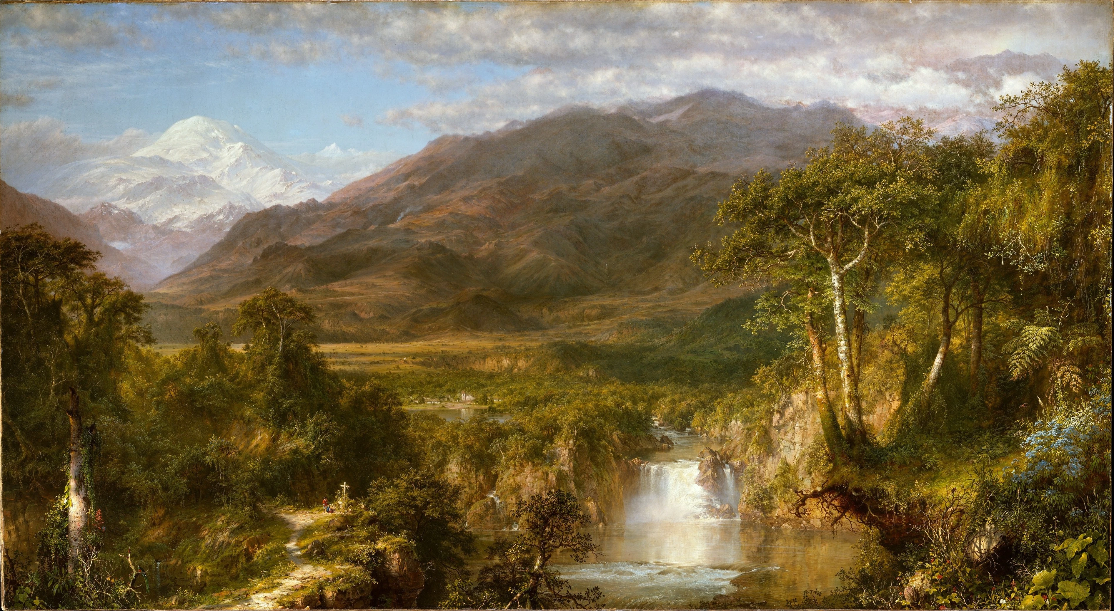
The Heart of the Andes by Frederic Edwin Church (1826–1900)

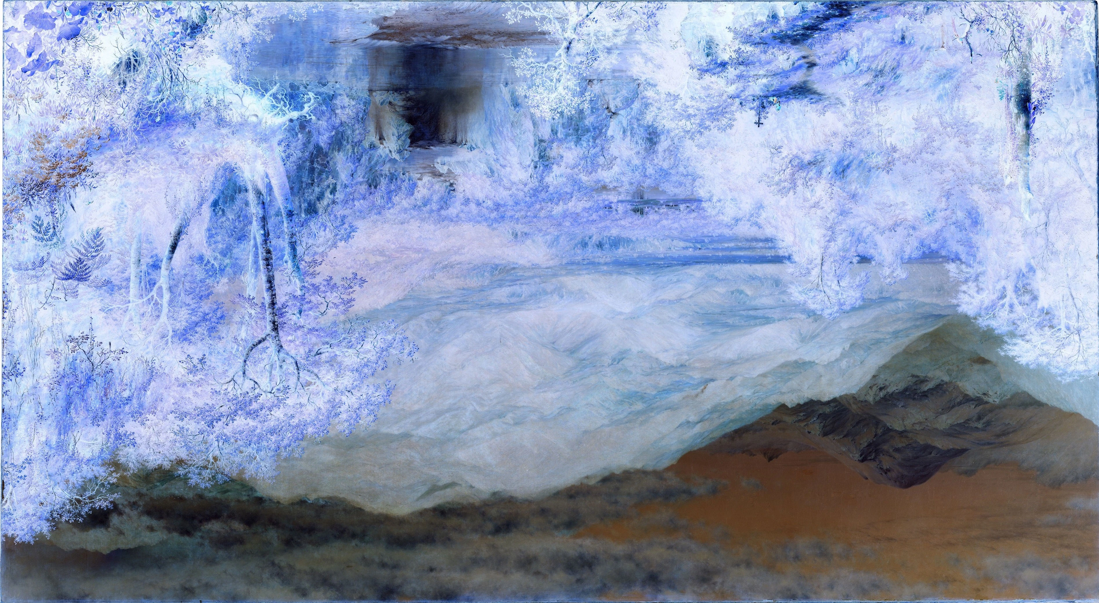
The Heart of Andes with inverted colors and rotated.
When looking at a landscape, objects in the distance appear to be tinted blue. This is because our atmosphere creates diffuse scattering and lowers the intensity of light reaching our eyes. This has had the peculiar effect on our minds to perceive cooler colors as more distant than warm ones and can of course be applied in art and design.
When warm and cool colors are used together on a surface an illusion of depth will occur. Warm colors will pop forward while cool colors falls back. An image with a very warm background but a cold foreground will lack depth and so we are able to balance warm and cold colors according to what we want to accomplish with our work.
Compare the two images to the right with each other. When the colors are inverted the sky seems to be closer to us than theriver or trees in the foreground.
Contrast[]
Contrast can be defined as the difference in visual properties that makes an object distinguishable from other objects and the background. Contrast in design helps to establish hierarchies of importance, create relationships between various elements, and draw the eye towards a certain area of the piece that help to drive the communication of the message.
In color theory, contrast can often be determined using opposites or colors that are very different from eachotherr. For example, black and white are considered to have high contrast, whereas orange and red are low contrast colors. Use of subtle color contrasts can help create harmony and a sense of cohesiveness in a composition, while high contrast can allow for emphasis and distinction.
Tools and resources
There are several resources online to help you find suitable colors or just play around with them. Common tools are and Adobe's Color CC (formerly Adobe Kuler) Color Scheme Designer. I highly recommend that you familiarize yourself with one or both of them and just have some fun.
See also
[Will be added soon]